Table of Contents
Understanding the anatomy of a search result page is crucial to search engine optimization. If you don’t, you won’t know where your best opportunities lie. And while the basics are a must for every business owner to understand, even experienced SEOs spend time analyzing the search results pages when strategizing on behalf of their clients. In fact, every SEO audit and strategy document I produce has a diagram similar to the one you’ll see below along with my analysis of that keyword SERP (search engine results page).
1. Paid Ads
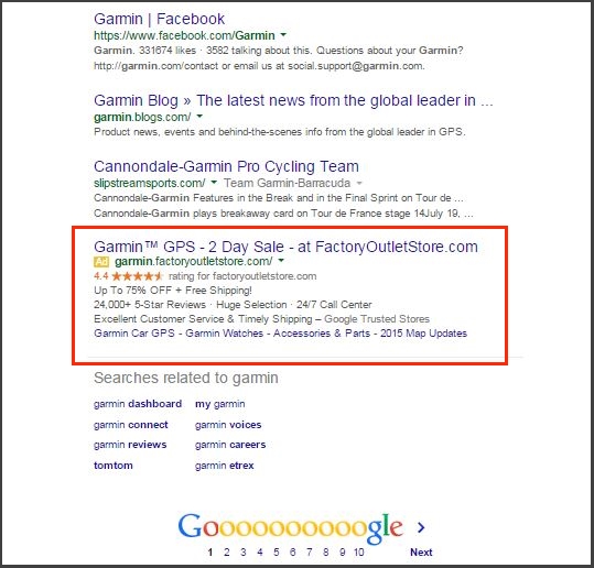
The first results at the top of the page are usually paid ads. Paid ads are how Google makes its money. Depending on your keyword niche, paid ads can cost as little as a dollar or as much as $300 every time someone clicks on the ad. There are usually three ads at the top of the page and a few more on the right sidebar. I’ve seen as few as four and as many as eight. These ads get clicked on by users only 6% of the time.
Placement in this section in purely pay to play. How high your rank here is determined by something known as a Quality Score multiplied by your maximum bid.
Your Quality Score is in turn influenced by a few different variables, including your click-thru-rate, keyword relevance to the ad group, landing page quality and relevance, relevance of your ad text, and your historical AdWords account performance.
Most search result pages have 9 or more ads. And this number is growing as Google tries to make more and more money from its primary revenue source—search ads. In addition, with the addition of rich snippets and various ad extensions, the amount of space taken up by ads on the average SERP is getting larger.
But fear not. Google ‘s AdWords expansion in size and number can only continue for so long. Too much intrusion into the actual search results and the quality of its search and user’s experience will begin to suffer. I do not believe any company, not even Google can ignore the needs of its users and still remain the dominant force in its industry forever. And the data bears this out. One recent study shows that 88% of SERPs have at least 9 organic links.
There are several types of paid ads. The frequency of each varies over time. I have provided the frequency as of the time this writing. But for more recent data check out the MozCast Feature Graph.
AdWords Top: This is the most common feature and currently appears around 62% of the time. It contains anywhere from 1, but most commonly 3 results.
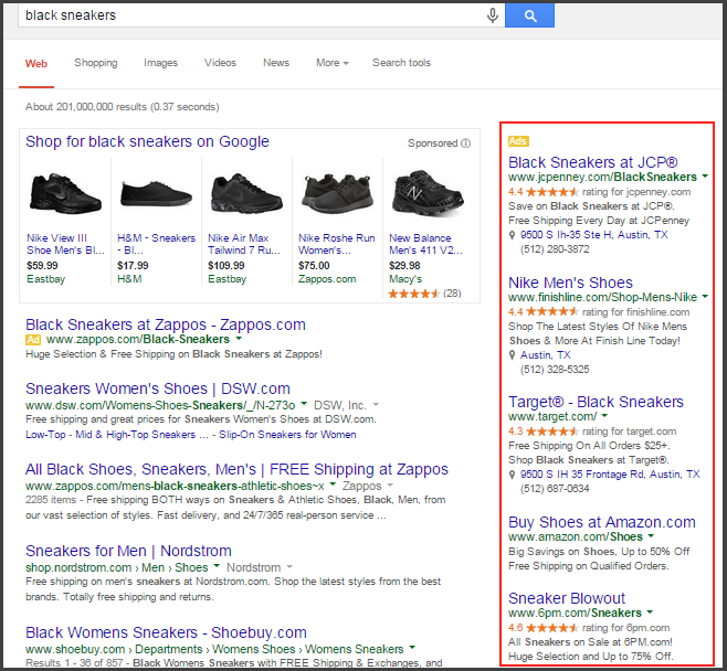
AdWords Side: AdWords ads appear on the right side bar about 52% of the time. When they appear, you’ll find anywhere from 4 to 8 ads here.
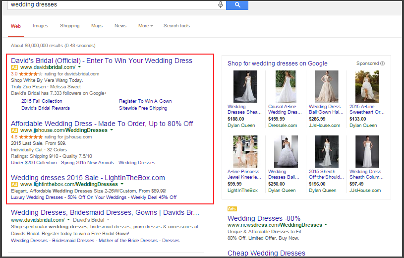
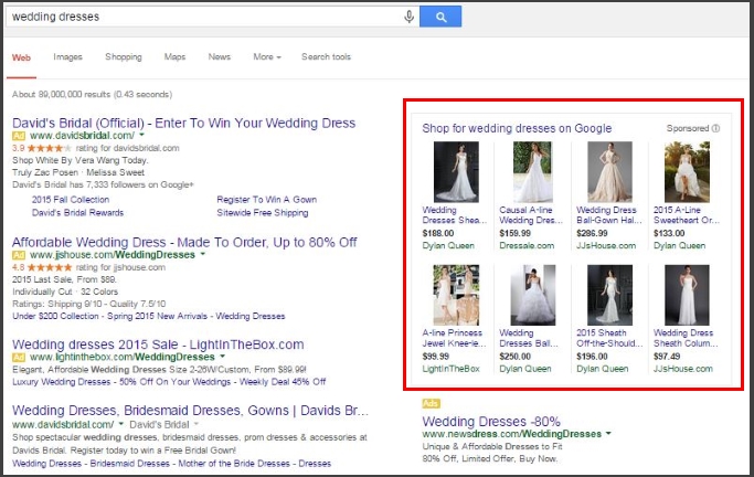
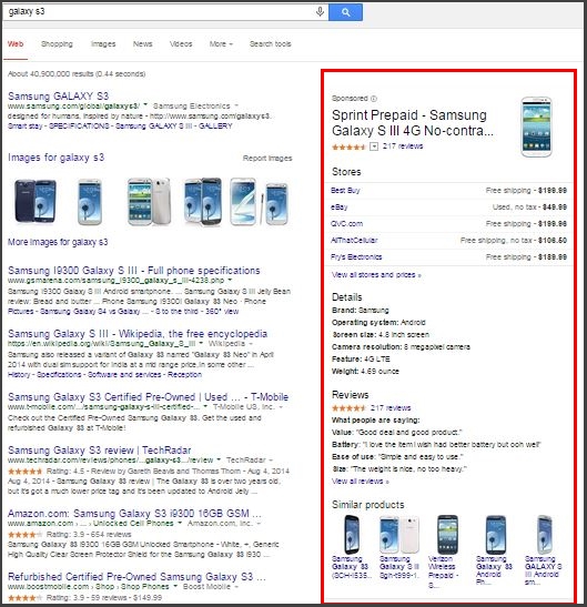
Product Listing Ads: These ads show up in their own box either before the organic results or to the right. They are made up of information provided to Google via the Google Merchant Center. The Merchant Center allows merchants to set up product data feeds that contain info on merchant products such as price, size, color, etc. They appear in SERPs about 20% of the time.
Product ads appear somethis look like this:
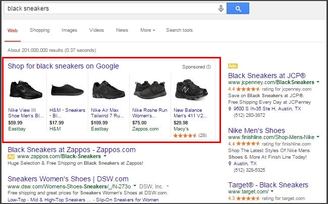
Sometimes they are on the side like this:
And recently, I’ve seen them within a knowledge panel, like this:
AdWords Bottom: Occasionally, AdWords ads will appear at the bottom below the non-paid search results. Interestingly, if you see ads on the side, you won’t see them at the bottom and vice versa. Ads appear at the bottom only 11% of the time.
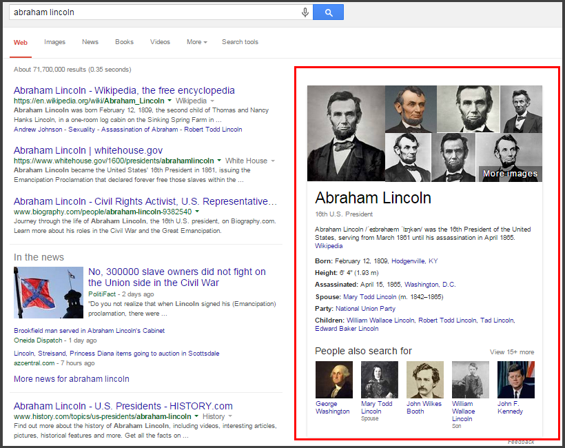
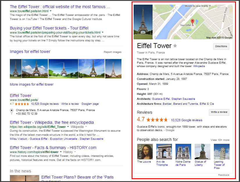
2. Knowledge Graph
The Knowledge Graph first launched on May 16, 2012 as the next generation of search. Plainly, for searches that involved people, places, and things, Google would begin to display the most important (read most searched for) basic information about those people, places, and things alongside the search results. So for searches like “Eiffel Tower”, Google displays a photo, a map, address, when construction started, the architect, reviews of visitors, and similar searches.
I’ll show you the family of SERP features that makes up the knowledge graph, their effect on the SERPs, and then I’ll discuss a bit about how we as web marketers can benefit.
Knowledge Graph Panels: These are the most common knowledge graph feature. Made up of boxes that appear on the right side of the page, they can be of information on people, places, and things. But interestingly for marketers, they can be made up of company and brand information. For example a search for Apple yields an excerpt about the company from Wikipedia, additional info such as its CEO, headquarters, and when it was founded. The box also links directly to some of Apple’s social profiles.
Knowledge panels for people look like this:
And for places they look like this:
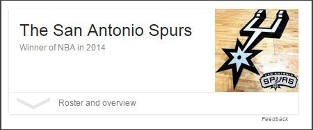
Answer Boxes: Answer boxes are Google’s attempt to directly answer a search query. So if you type in “who won the 2014 nba finals” you get my favorite team:
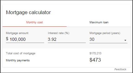
But answer boxes don’t just appear when you type in an actual question. They often appear when Google anticipates what you are looking for. For instance, type in “mortgage calculator” and Google provides one right in the SERP.
Answer boxes come in a huge variety of shapes and features. Expect more variety in the future as Google continues to launch, test, and evolve its answer boxes. Currently appearing about 4% of the time, I expect this number to grow in the coming years.
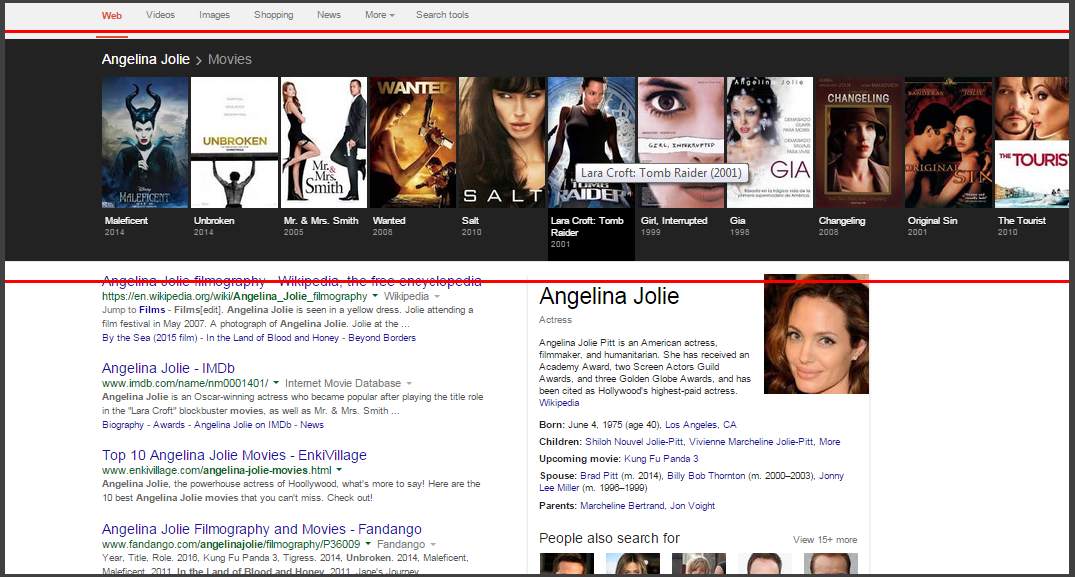
Carousels: Black carousels appear at the top of the SERP even before the ads. They seem to appear for media related searches like “Angelina Jolie movies” or “first person shooter games”.
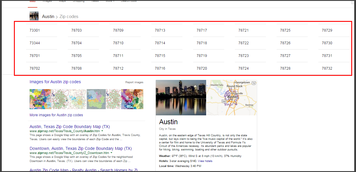
A different white background carousel appears for data related searches like “Austin zip codes”.
Currently, all of these carousels combined appear less than 1% of the time.
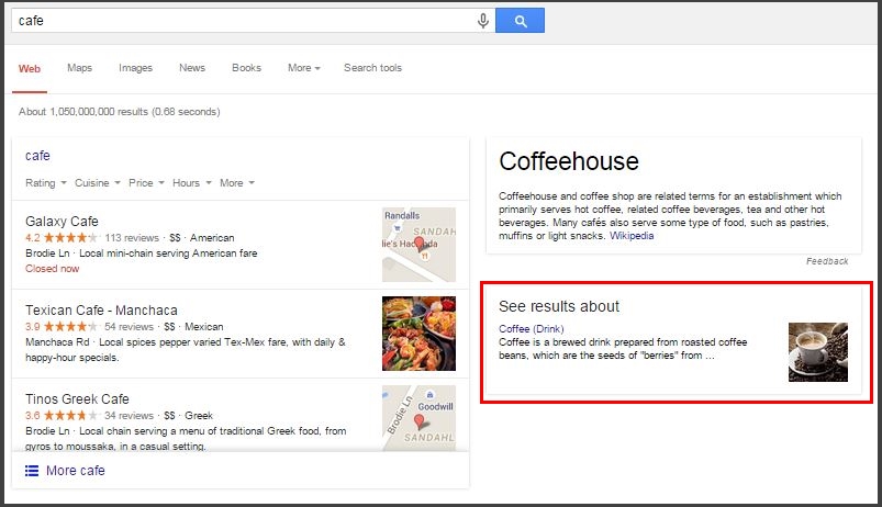
Disambiguation Box: This shows up when Google is unsure what you are searching for. For instance a search for “café” shows restaurant options near me, but also pulls up this disambiguation box about coffee.
The appearance and proliferation of the knowledge graph in search has caused a bit of uproar in the online marketing and SEO community because the knowledge graph (mostly the answer boxes and knowledge panels) are stealing clicks away from websites. Previously people were shown pages that contained information and in order to get the answers they were seeking, they had to actually click through to a web page. Now for as many as 20% of searches, Google is providing these answers right there in the SERP. And these answers come from content created by others. So Google is sometimes “borrowing” content from other webmasters and sites (occasionally without attribution) and usurping that traffic now for itself.
But all is not lost. Some of these features may present opportunities. For instance, with the right markup, businesses can have their own knowledge panel for brand name searches. In order to obtain a knowledge panel for yourself or your brand, you’ll need to create Wikipedia and www.Wikidata.org profiles. You’ll also need to implement organization or person markup
In addition, some content that Google uses in answer boxes does not come from the 1st ranking website. So there is an opportunity to structure your content such that it is more appealing to the Google answer box. If successful, this tactic can help smaller brands outrank some of the biggies in the space. Granted, placement in the answer box may not result in traffic to your website since the answer is provided right in the SERP. But no doubt this placement leads to higher visibility for your brand.
3. Vertical Search
Vertical search is a search engine that focuses on a certain type of online content, like images, shopping, or news.
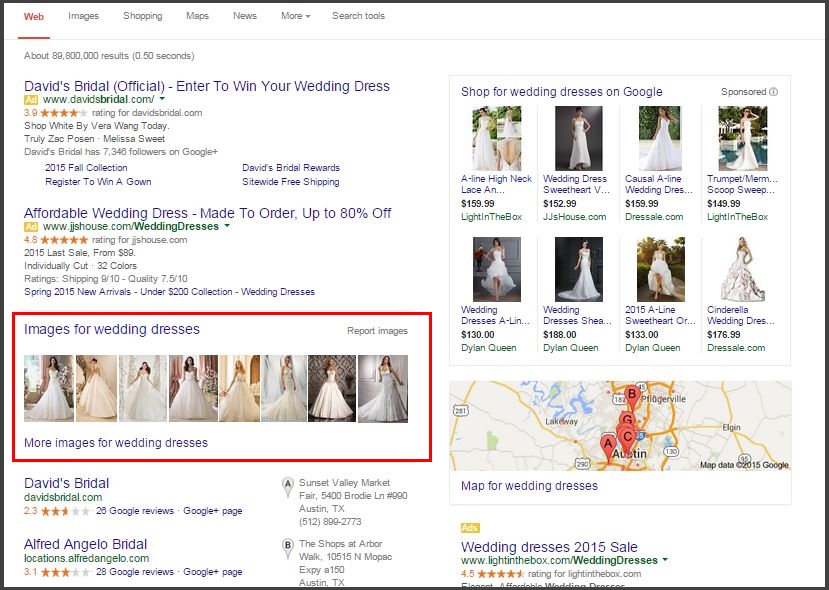
Image Results: Images results pull from Google image search and appear in about 32% of searches. In order to optimize your images for search, name them something other than IMG193u594.jpg. Use a name that is both relevant to the image and to the content of the page. Make use of alt text and use keywords in the alt text whenever possible. Finally, place the image in the most relevant area on the page so that the image is contextually placed.
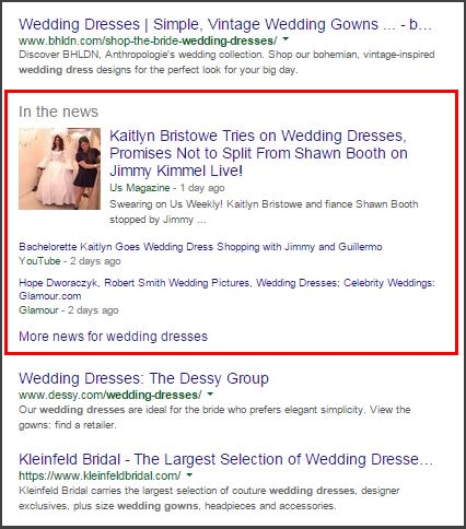
News Box: News results are also pulled exclusively from Google News. They appear in roughly 17% of searches.
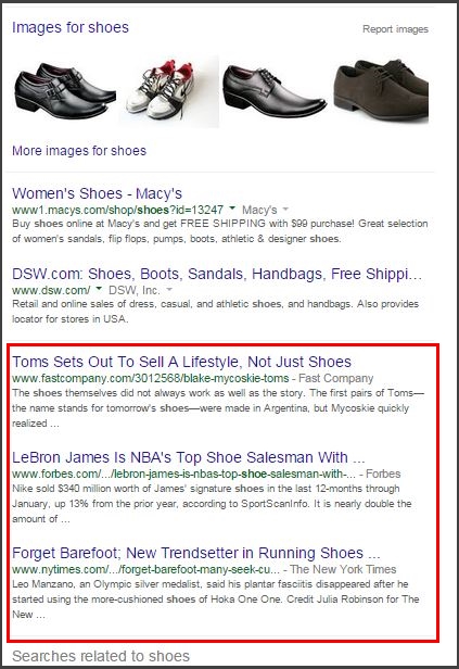
In-depth articles: In depth articles highlights long form in-depth content from high authority sites. This feature used to be called out in a block, but now is part and parcel of the rest of the organic results. In depth articles appear in 13% of searches.
Videos: Videos can appear anywhere on a SERP and appear in 8% of searches.
4. Organic Results
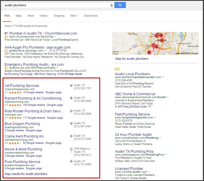
I am calling everything that is not specifically categorized in this article organic results. They are results that are not paid and are not another feature. For queries that are local in nature (think “Austin plumber”) there is usually at least one, but not more than three, organic results in this section before the local results.
Placement here is complex. Google doesn’t publish details about how its algorithm works. However they have said that there are 10,000 ranking signals. A huge generalization would be to say that top placement depends on a website with good user experience, plenty of social engagement, and number and quality of backlinks.
5. Local Organic Results
Local results are influenced by Google My Business. These are product and service providers who do business within a defined local area. To qualify for a Google My Business listing, you must meet with your customers face to face during your stated business ours. There are as few as 1 or as many as 7 results here.
Local Pack: The Local Pack is made up of local business listings. Most often appearing on the top half of the page, but I have seen them everywhere. It is also often referred to as the 7-pack because it is commonly made up of 7 results, but I have seen 1 and 3.
August 7, 2015 Update: The Local 7 Pack has changed into a 3 pack and looks substantially different.
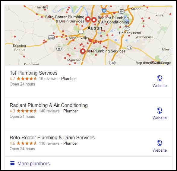
One obvious impact is that there are fewer opportunities to appear in the pack on the first page. But the total opportunity for local on the first page does not appear to be diminished. Interestingly, clicking on these three results takes one to the Local Finder and does not open a Knowledge Panel as it did before. Once in the Local Finder there are 20 results on the first page. Another difference is the lack of phone numbers and the disappearance of the Google + page. The lack of phone numbers will require additional clicking from the user as these only display once you are in the Local Finder. Some traffic will likely go straight to the website as searchers click on the website icon. But most I suspect will click on the name of the business and wind up in the Local Finder.
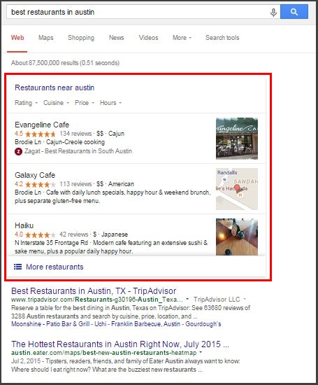
Local Near: Near results are pulled from Google maps and called out with a box and a title such as Restaurants near Austin.
Placement in the local pack depends on a variety of factors, however some of the most important are physical address in city of search; number and consistency of structured citations; name, address, and phone number matching that provided on the Google My Business page; and quantity of Google reviews with text.
Although placement in the local pack is difficult and complex, with qualified help, it is generally easier to obtain placement here than it is to rank in the regular organic section. Why? Before Google incorporated the local pack, it was almost impossible for a small local business to compete with large brands in the SERP. On average, national or regional brands have websites with much more authority than local business sites. As a result, the mom and pops were routinely beat out.
It’s true that Google tends to favor brands. But certain searches are local by nature. For instance when people search for an accountant or a plumber they tend to attach a city to their search. So the search becomes “San Diego plumber” or “accountant in Dallas”. By including local results, Google recognized that the established mom and pop might be the best result for the searcher because the business is for instance closer to the searcher than perhaps a national chain or has as much local authority and reputation as the local branch of the national brand.
6. Miscellaneous
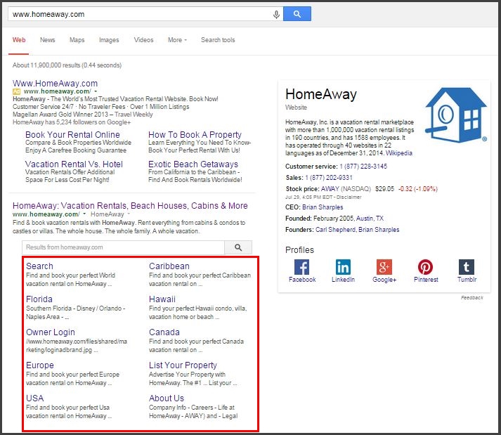
Site-Links: Site links are links to internal pages within the domain for the search result. They appear intended and are arranged into two columns. They display only for branded or navigational searches because Google is saying, hey, if you are doing a search on Google for this website, let me go ahead and try to direct you straight to some of the most important pages to try to save you a click or two. A result can have anywhere from 1 to 10 sitelinks.
Google’s search engine results are becoming more and more varied and complex. For SEOs, keeping up with the changes means spotting opportunities as they arise and adjusting our strategies to match.
Having problems with your SEO performance? Don’t be afraid to reach out!